
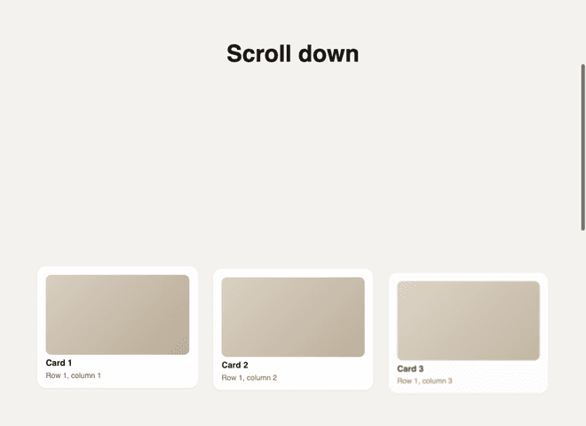
TL;DR:
Browsers can now tie a CSS animation to scrolling instead of a timer, with animation-timeline: view(). I used it to fade sections in as they scroll into view, with no library and no JavaScript in Chrome, Edge and Safari 26. Browsers without it (Firefox, older iPhones) get a small IntersectionObserver fallback that only hides content when it's sure it can show it again. My first version worked but was too quick to notice, and the fix was mostly bigger numbers.
I'm building an online shop, and I wanted the sections on its home page to fade in as you scroll to them. You've seen the effect. A row of products slides up a little and fades in as it comes into view.
The usual way to do this is a library like Framer Motion or AOS, or your own IntersectionObserver. They all work the same way: JavaScript watches the page, notices an element coming into view, and starts an animation.
But browsers can now do this on their own, in CSS. I wanted to see how far that goes, and it turns out to be most of the way.
What I was working with
- Next.js 16.3.4, React 19.2.8 and Tailwind CSS 4. The CSS itself is plain CSS, so none of that matters for the main part.
- Browser support for
animation-timeline: view(): Chrome and Edge 115 and up, Safari 26 on Mac and iPhone. Firefox only has it in preview builds so far. That's why the fallback matters.
Animations that run on scroll instead of time
A normal CSS animation runs on a clock. You say "fade in over 0.9 seconds", and it plays from start to end in 0.9 seconds, whatever the user does.
A scroll-driven animation swaps the clock for something else: where the element is on the screen. Think of a dimmer switch. Instead of a timer turning the light up, your scrolling turns it up. Scroll down and the card fades in. Scroll back up and it fades back out, because you're turning the dimmer the other way.
Here's the whole thing:
@supports (animation-timeline: view()) {
  @media (prefers-reduced-motion: no-preference) {
    .reveal {
      animation: reveal ease-out both;
      animation-timeline: view();
      animation-range: entry 0% cover 30%;
    }
  }
}

@keyframes reveal {
  from {
    opacity: 0;
    transform: translateY(4.5rem) scale(0.95);
    filter: blur(6px);
  }
}
Then any element with class="reveal" fades in as it scrolls into view. Line by line:
animation-timeline: view() is the dimmer switch. It says "drive this animation with this element's position in the viewport, not with time". That's also why there's no duration in the animation line. The scroll is the duration.
The keyframes only have a from. That's on purpose. When you leave out to, the browser animates towards the element's normal style. So the card starts invisible, lower down, a bit smaller and blurry, and ends up exactly as it would look with no animation at all.
both keeps the starting look before the animation begins and the end look after it finishes. Without it, a card waiting below the screen would sit there fully visible, then suddenly jump to invisible the moment its animation starts.
One small trap: put animation-timeline after the animation shorthand, not before. The shorthand resets animation-timeline back to normal time, so if it comes second it quietly cancels your scroll timeline.
What "entry 0% cover 30%" means
animation-range decides where in the element's trip across the screen the animation starts and ends. It uses named stretches of that trip, and two of them matter here:
- entry is the stretch where the element is coming in through the bottom edge. It starts when the top of the element first peeks in, and ends when the whole element is on screen.
- cover is the full trip. It starts at that same first peek, and ends when the element has completely left through the top.
So entry 0% cover 30% means: start the moment the card first peeks in, and be done 30% of the way through its whole trip across the screen. On a normal laptop screen that's a few hundred pixels of scrolling.
My first version was too quick to see
My first version technically worked. It used entry 5% entry 45%, a linear timing, and a much smaller move:
.reveal {
  animation: reveal linear both;
  animation-timeline: view();
  animation-range: entry 5% entry 45%;
}

@keyframes reveal {
  from {
    opacity: 0;
    transform: translateY(2rem) scale(0.98);
  }
}
When I measured it on a test page, the whole fade was over after about 125 pixels of a 224-pixel card had come into view. So the animation happened while the card was still sitting at the bottom edge of the screen, which is exactly where your eyes aren't. And the card only moved 2rem and shrank by 2%, so even if you were looking there, there wasn't much to see.
The fix was mostly bigger numbers. A longer range (entry 0% cover 30%) spreads the fade over about 300 pixels of scrolling, so it's still happening when the card reaches the middle of the screen. The card now moves 4.5rem, starts at 95% of its size, and starts blurred, which makes the change easy to notice. And ease-out makes it start quickly and settle gently, instead of moving at one flat speed.
Making a row arrive one card at a time
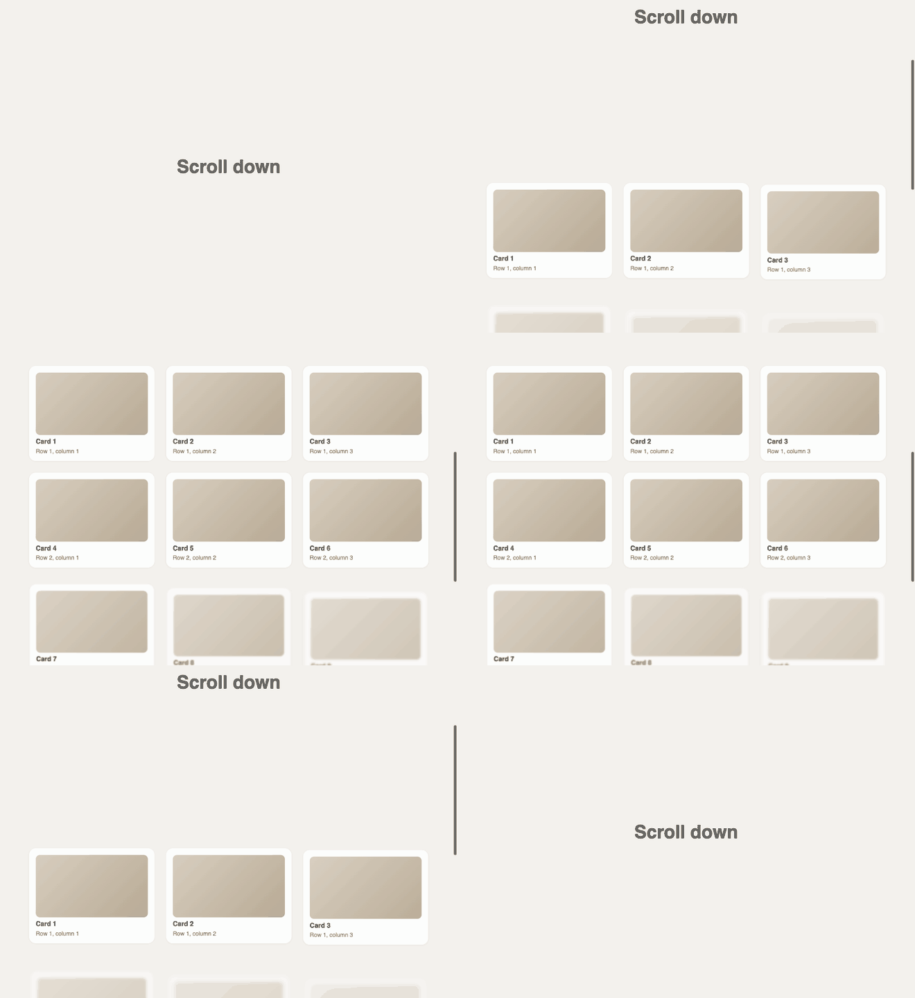
When three cards sit side by side, they all enter the screen at the same moment, so they'd all fade in together. That looks fine, but it looks better when they arrive one after another, left to right.
With a timer, you'd add a delay. With a scroll timeline there's no clock, so instead I give the second and third card in each row a later range:
/* Siblings in a row arrive one after another rather than all at once. */
.reveal:nth-child(3n + 2) {
  animation-range: entry 8% cover 36%;
}
.reveal:nth-child(3n + 3) {
  animation-range: entry 16% cover 42%;
}
3n + 2 means "the 2nd, 5th, 8th child, and so on", which is the middle card of every row of three. 3n + 3 is the 3rd, 6th, 9th, the last card in each row. Each one starts and finishes a little later in the scroll, so they arrive in order. On the test page, at the same scroll position, the three cards in the first row were at 67%, 54% and 43% opacity.
This assumes rows of three. On a phone, where the cards stack in one column, it just means some cards reveal a little later than others, which I'm fine with.
Photos that drift as you scroll
The same idea gives you parallax for free. The category photos sit inside a frame, and the photo moves up slightly slower than the page as you scroll:
.drift {
  animation: drift linear both;
  animation-timeline: view();
}

@keyframes drift {
  from {
    transform: translateY(-8%) scale(1.18);
  }
  to {
    transform: translateY(8%) scale(1.18);
  }
}
There's no animation-range here, so it uses the default, which is the whole trip across the screen. The photo moves from 8% up to 8% down over that trip. The scale(1.18) is there so the photo is always bigger than its frame. Without it, moving the photo would show an empty strip at the top or bottom of the frame.
Never hide content you can't show again
This is the part I care about most. An animation that starts at opacity: 0 has a nasty failure mode: if the animation never runs, the content stays invisible.
That's why everything sits inside @supports (animation-timeline: view()). A browser that doesn't understand scroll timelines skips the whole block, so it never applies the hidden starting state, and the content just shows up normally. The same goes for prefers-reduced-motion. If someone has asked their system for less motion, the block doesn't apply and nothing moves.
It also means the content is never hidden in the HTML itself. The page arrives fully visible, and only the animation hides it for a moment. Search engines and anyone with CSS turned off see everything.
The fallback for browsers without scroll timelines
Firefox and iPhones older than iOS 26 skip the CSS block, so they get no animation at all. That's safe, but I wanted them to get the reveal too. So for those browsers only, I fall back to an IntersectionObserver, which is what the libraries use.
The tricky part is the same rule as before: only hide content if something will definitely show it again. If I hid everything in CSS and the JavaScript failed to load, the page would be blank.
So it's opt-in. A tiny script in the <head> runs before anything is drawn on screen, and only turns the fallback on when all three of these are true: the browser can't do scroll timelines, it does have IntersectionObserver, and the user hasn't asked for less motion:
(function () {
  try {
    var d = document.documentElement;
    if (CSS.supports("animation-timeline: view()")) return;
    if (!("IntersectionObserver" in window)) return;
    if (matchMedia("(prefers-reduced-motion: reduce)").matches) return;
    d.classList.add("reveal-js");
    setTimeout(function () {
      if (!d.classList.contains("reveal-ready")) d.classList.remove("reveal-js");
    }, 3000);
  } catch (e) {}
})();
It adds a reveal-js class to the <html> element, and only that class hides the cards:
html.reveal-js .reveal {
  opacity: 0;
  transform: translateY(4.5rem) scale(0.95);
  filter: blur(6px);
  transition:
    opacity 0.9s ease,
    filter 0.9s ease,
    transform 0.9s cubic-bezier(0.2, 0.7, 0.2, 1);
}
html.reveal-js .reveal.is-visible {
  opacity: 1;
  transform: none;
  filter: none;
}
The setTimeout is the safety net. The React side adds a second class, reveal-ready, when it starts watching the page. If that hasn't happened within three seconds (the JavaScript bundle failed, or the phone is very slow), the script removes reveal-js and everything simply shows. A late page is better than a blank one.
Why run it in the <head> instead of in a React component? Because a component only runs after the page has been drawn. The content would show, then vanish, then fade back in. Running before the first paint means the cards are hidden from the start.
The watcher itself is a small client component in the root layout:
"use client";

import { usePathname } from "next/navigation";
import { useEffect } from "react";

export function RevealObserver() {
  const pathname = usePathname();

  useEffect(() => {
    const root = document.documentElement;
    if (!root.classList.contains("reveal-js")) return;
    root.classList.add("reveal-ready");

    const observer = new IntersectionObserver(
      (entries) => {
        for (const entry of entries) {
          if (!entry.isIntersecting) continue;
          entry.target.classList.add("is-visible");
          observer.unobserve(entry.target);
        }
      },
      { rootMargin: "0px 0px -8% 0px" },
    );
    document.querySelectorAll(".reveal:not(.is-visible)").forEach((el) => observer.observe(el));
    return () => observer.disconnect();
  }, [pathname]);

  return null;
}
When a card comes into view, it gets is-visible and the CSS transition fades it in. Then the observer stops watching that card, so it only happens once. The -8% bottom margin waits until the card is a little way up the screen instead of at the very edge, which is the same lesson as my first CSS version. The effect re-runs when pathname changes, because in Next.js moving to another page doesn't reload the document, so new cards need watching.
The stagger works with a delay this time, because here there is a clock:
html.reveal-js .reveal:nth-child(3n + 2) {
  transition-delay: 0.1s;
}
html.reveal-js .reveal:nth-child(3n + 3) {
  transition-delay: 0.2s;
}
The fallback does feel a little different. It plays once, on a timer, and doesn't rewind when you scroll back up. The CSS version is tied to your scrolling the whole way. I think that's a fair trade for a fallback.
In the root layout, the script goes in the <head>, the watcher at the end of the <body>:
<html lang="en" suppressHydrationWarning>
  <head>
    <script dangerouslySetInnerHTML={{ __html: revealScript }} />
  </head>
  <body>
    {children}
    <RevealObserver />
  </body>
</html>
suppressHydrationWarning is needed because the head script changes the <html> element's classes before React takes over the page. React would otherwise notice the difference and warn about it.
Don't fade the biggest text on the page
The hero at the top of the page has its own entrance, and there's one detail there worth copying. The headline only moves up. It never fades in:
@media (prefers-reduced-motion: no-preference) {
  .enter-lift {
    animation: lift 0.9s cubic-bezier(0.2, 0.7, 0.2, 1) both;
  }
  .enter-rise {
    animation: rise 0.9s cubic-bezier(0.2, 0.7, 0.2, 1) both;
  }
}

@keyframes lift {
  from {
    transform: translateY(1.5rem);
  }
}

@keyframes rise {
  from {
    opacity: 0;
    transform: translateY(1.5rem);
  }
}
The headline gets enter-lift, and the line under it and the buttons get enter-rise with small delays (150ms and 300ms). The reason is a speed score called Largest Contentful Paint. It measures when the biggest thing on the screen, usually the headline, actually shows up. If the headline starts at opacity: 0, it isn't counted as shown until the fade is done, and the page looks slower than it is. Moving it without fading it keeps the nice entrance and keeps the score honest.